What happens when you’re asked to create new undergraduate recruitment materials for a faculty with diverse schools and programs and an identity as innovative, artistic, and interdisciplinary? The pressure is on.
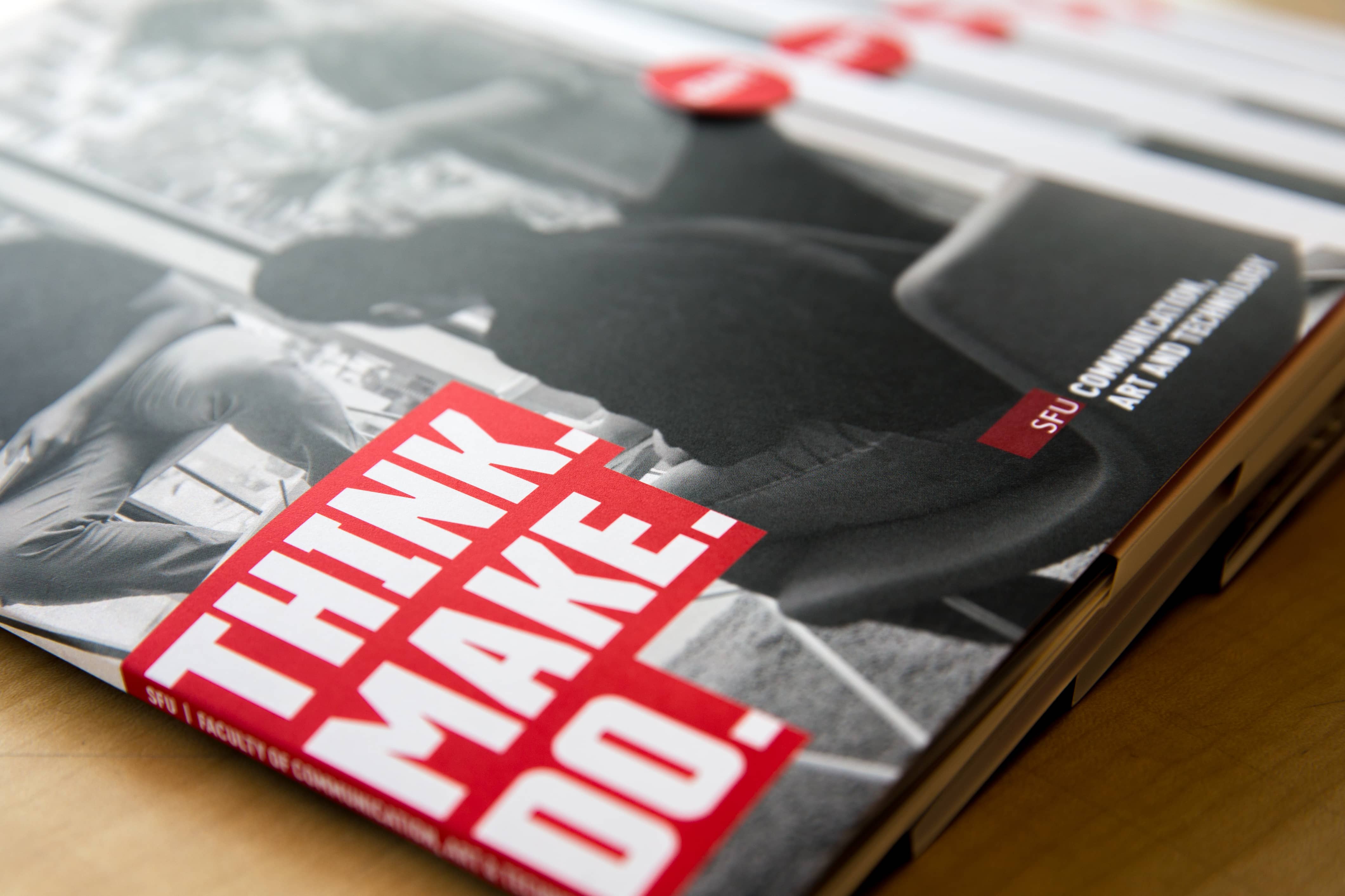
The Faculty of Communication, Art and Technology recruitment brochures that had been used in the past were created separately by each of our schools, looked very different from each other, and didn’t follow SFU brand guidelines. When they were distributed as a package, they were simply put into a standard red SFU 8.5x11 folder. The result was not a cohesive identity for the faculty. For this recruitment season, there was a desire to update the materials to create something more cohesive and also more creative to represent the faculty as unique and innovative while still highlighting the identities of each of our schools (School for the Contemporary Arts, School of Communication and School of Interactive Arts and Technology).
With a project that involved the dean’s office and three schools, there were many people to consult and collaborate with along the way. We started by meeting with our Director of Student Affairs to discuss the project and identify the audience and goal of the materials. The directors of each school and their communicators were also involved from the beginning. They were kept up to date along the way and asked to provide feedback.
Through our discussions with each unit, we explained the benefits of having a cohesive recruitment package that leveraged SFU’s master brand.
Working with communicators in our schools, we ensured that the content reflected the unique identity of each unit, while keeping within a defined content template that included a brief introduction to the school, what students can study, a couple of featured alumni talking about their experience, and images to represent their program. In one case, we consulted with the communicator but took care of sourcing the content and completing the design; in another case, we provided a template and the communicator added the content for their school. Each school has their own unique needs, and it was important to ensure that our stakeholders in the schools were involved from the beginning and happy with the outcome.


After consultation with Communications and Marketing, we made a few small changes to the design to ensure our materials were following the new brand guidelines as much as possible. (Disclaimer: we didn’t manage to follow the brand guidelines 100%, but we plan to make these changes before any future print runs). We also worked with C+M to source content for a general SFU brochure that was included with the package.
There are two primary audiences for these recruitment materials: high school counsellors and prospective students. We decided to create a folder that could highlight the faculty itself and house a unique brochure for each school. The folder and brochures can be used together as a recruitment piece or as a general overview of the faculty when our staff attend external meetings. The folder can be re-purposed to house other brochures in the future, and the brochures can each be used on their own for school-specific recruitment events. A general SFU brochure is also included to introduce prospective students to the university.
The SFU brochure is the first one seen upon opening the brochure, so it was important that it featured a black and white image to reinforce the SFU brand. All our other images were used in colour to represent each school’s unique identity.
The folder was designed from scratch and with the help of Document Solutions a die cut was produced that can be re-used for future print runs or other iterations of the same design.

These recruitment packages have been very well received both by our internal stakeholders and at events such as Counsellors Day. Using the cohesive look and feel of the new brand, consistent consultation, and relevant content, we were able to create something that served the needs of multiple audiences and stakeholders. We are now planning to create another series of brochure for our graduate programs that will fit into the same folders and be another versatile package that can be used all together or separately.
